I discovered a new, tiny detail in Blender3D. It’s a tiny thing that made a big difference.
I was trying to make etches onto a cube with an image — like engrave the image in.
I wanted it to look like this:
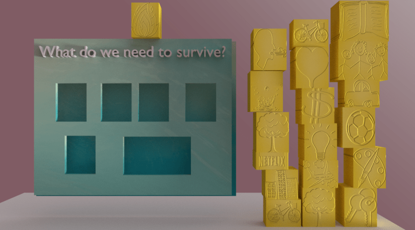
See, nice and clear! However, it was just looking like this:
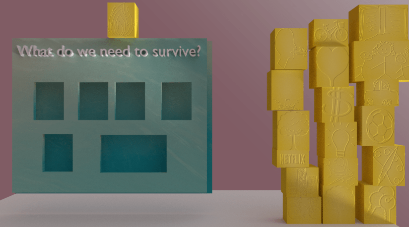
Much less crisp and sharp, and when I went to print it out (the images were for a poster) it didn’t show up hardly at all.
Almost by accident, I discovered what the problem was. Below are two material settings, one for the ‘good’ image and the other for the muddled one:
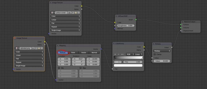
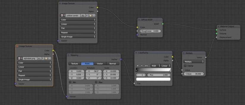
Yes! The only difference was that for one image, the ‘Mapping’ node in the Materials was set to ‘Texture’ (the bad image) and on the other it was set to ‘Point’. And it made all that difference. Amazing, and so, so easy to miss.
