
I had to verify a fact for my article I’m working on now. It’s about a bunch of polluting power plants being built in a neighborhood in Maryland where mostly Black people live. Having lived in Maryland, I can tell you that this is exactly the sort of thing that Maryland would do.
What the community activists told me was: there is no other place in the United States where you have 3 natural-gas power plants of that size within 2.9 miles of each other. So of course, I wanted to include that in the article, it’s a pretty powerful statistic.
But, no one could show me any report that backed it up.
All I got was a fact-sheet prepared by the non-profit Earthjustice. That fact-sheet said: after all 3 power plants are built, Brandywine will have more power-generating capacity than 99.9% of the country.
This was, first, a more confusing statistic – a lot less clean – compared to the first version. Second, I didn’t have any idea how they’d come up with that figure.
So, I got out my own nifty mapping and GIS skills. I felt so smart!! I have done GIS stuff for 10 years; and the particular program that I used, Google Earth Engine, I used almost every day for the last 2 years of my Ph.D. work. But I haven’t really touched it since I graduated in May. When I pulled it open, I kind of just stared at the screen. I couldn’t remember how to do anything. And it’s only been two months!
But soon I was coding up a storm:
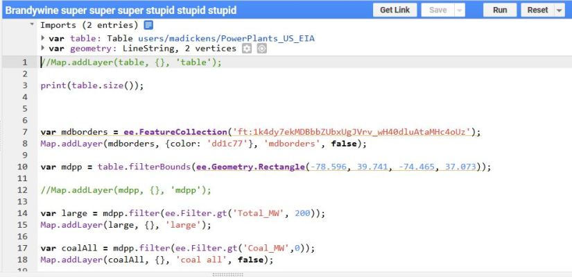
I found a big spreadsheet from the EPA that lists all the power plants in the US. Somehow, I managed to upload that in Earth Engine. Then, I found a shapefile (computer map) of Maryland. Then, I was able to search through the giant EPA spreadsheet, and first pull out only the power plants in Maryland, then only the large ones, then only the fossil fuel-powered ones. It was super great! I’d forgotten I could do all that in Earth Engine, so it was like getting surprise presents one after the other.
Then my script crashed. So I had to redo everything, and I made sure to express my anger in the new script title.
Then, I mapped it all:
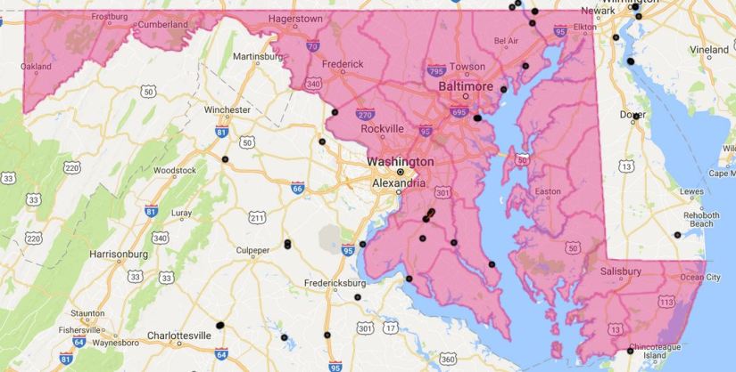
The black dots are the power plants with a capacity of over 200 megawatts, of all fuel types. There’s one place that has two such plants, by Riviera Beach (the blob south of Baltimore). And the string of 3 black dots, with the red line over them, are the three power plants set to be running in Brandywine by next year.
So the statistic I was able to safely use in the article is: there is no other community in Maryland that will have as many large power plants as Brandywine. It would have been nice to go further and see if this was true for the whole US, but I didn’t have time to visually examine the map; or alternatively, I wasn’t sure how to get Earth Engine to do those calculations for me.
But any case, I’m really happy I was able to do this little bit. And it was worth it for sure to give the article a stronger backing.

1 thought on “Making maps”